
CSS Animation - Spinning Newspaper
What are CSS Animations?
CSS Animations are a feature of CSS3 allowing developers to animate an object becoming visible.
To define a CSS animation, one needs to define keyframes in terms of percent, then add the appropriate "animation" attribute to an object. In this article I will make a spinning newspaper animation using this image from The Simpsons (copyright warning): 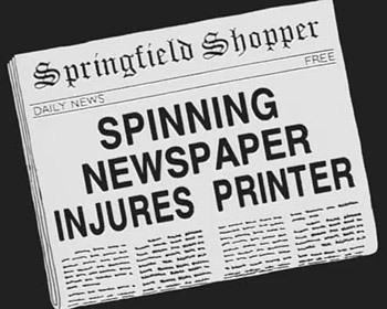
The transform: property
Much of what you would want to do with animations is available with the Transform property.
In this case, we'll be causing the image to spin and get larger, acheived through transform: scale and transform: rotate. Rotate takes a rotation in degrees. Let's start by making it spin twice.
@keyframes spinny {
    0% {
        transform: rotate(0deg);
    }
    50% {
        transform: rotate(720deg);
    }
}
(Be forewarned: this animation won't work in WebKit-based browsers, though it will work in Chromium-based ones.)
Scale takes an argument in size relative to 1 for some reason, and transformations are space- rather than comma-separated, so the way to scale the newspaper would be as follows:
@keyframes spinny {
 0% {
 transform: rotate(0deg) scale(0.1,0.1);
 }
 50% {
 transform: rotate(720deg) scale(2,2);
 }
}
Filter and Opacity are also commonly used with animations, and we'll use them for a nice fade-out:
@keyframes spinny {
 0% {
 transform: rotate(0deg) scale(0.1,0.1);
 opacity: 1;
 }
 50% {
 transform: rotate(720deg) scale(2,2);
 }
70% {
filter: none;
opacity: 1;
}
100% {
filter: blur(100px);
opacity: 0;
}
}
Now let's create a CSS class with this animation enabled:
.spinner {
text-align: center;
position: absolute;
top: 40%;
left: 40%;
animation: spinny 8s linear 0s 1 normal;
opacity: 0;
transform: scale(2,2);
}
Make sure to include all of the final settings or else the animation will end improperly by transitioning into its default state.
The animation: property used here is a "combo property" that goes as follows:
-
spinny: Name of the animation
-
8s: speed of the animation in total length
-
linear: progression of the animation
-
0s: delay before showing animation
-
1: number of times to play animation
-
normal: direction of the animation
Now add the appropriate content to <body>:
<div class=spinner> <img src=spinning_paper.jpg></div>