Media Queries in CSS
Responsiveness
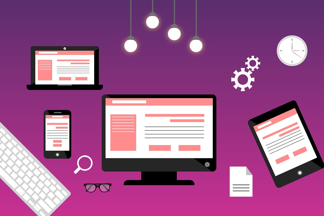
Responsiveness in web design is the set of features designed to give the website a unified look on mobile, tablet, and desktop platforms. A responsive website will look good on every device.
Because smartphones and tablets are increasingly used to access websites, responsiveness is absolutely essential to website building, and the simplest way to implement it is via media queries.
Useful media queries
CSS @media queries are a simple way of making a site responsive, usually taking the format of:
@media only screen and (condition: value){
    property: value;
}
It's recommended to make your website for mobile and make @media queries specific to desktop; this is the "mobile-first" philosophy. Useful media queries to detect a desktop are only screen and orientation: landscape and only screen and (min-width: 1000px). Always place queries at the end of the document, or else they could be overridden by other properties.
Within those queries, another property which is very useful is the text-size-adjust property, which takes a percentage of the standard text size as the size text will be rendered at. Not all browsers support it, but most mobile browsers will. For example:
body {
    text-size-adjust: 250%;
    -webkit-text-size-adjust: 250%;
}
@media only screen and (min-width: 1000px){
    body {
        text-size-adjust: 100%;
        -webkit-text-size-adjust: 100%;
    }
}
Make sure to include both text-size-adjust and -webkit-text-size-adjust in order to support iThings and the Librem 5.
Conclusion
CSS's @media query is a godsend for web developers. It makes responsiveness much easier than otherwise. On the other hand it isn't quite universally supported, though both Android and iOS support them in the latest version.